Here comes Sandisk with a rebrand
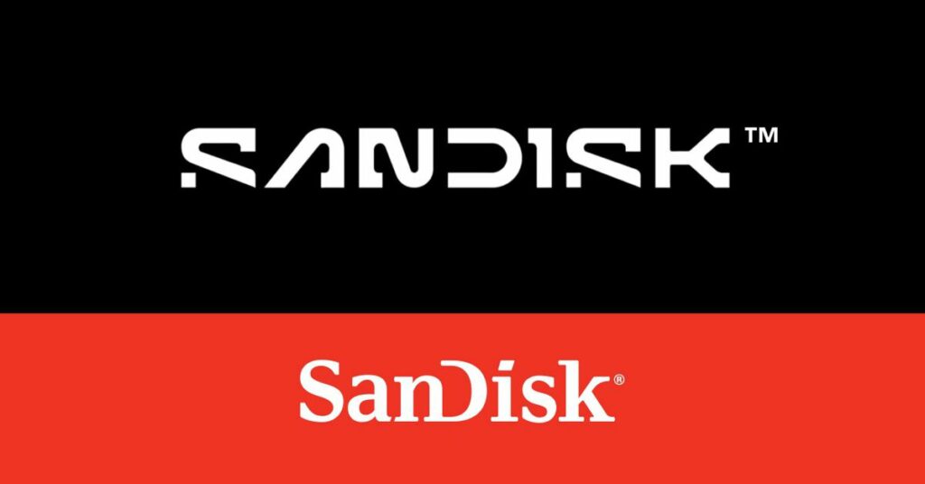
Sandisk is trading in its classic inter-capped serif logo style for a new, futuristic all-caps design. The company’s decision to rebrand comes ahead of its spinoff from parent company Western Digital, planned for next year.
In a recent video, Sandisk explains that the new logo is inspired by “a single point of data” or a “pixel.” The redesigned logo maintains the open “D” letter while pairing it with a new “pixel-driven S,” which symbolizes “the collaboration and partnership required to actualize our purpose and tap into new possibilities.”
The company’s rebranding move comes as Western Digital prepares to spin off Sandisk, a move that was originally planned for this year. Western Digital acquired Sandisk in 2016.
Sandisk has faced controversy in the past, including an issue with its popular SanDisk Extreme SSD product last year. The product would wipe owners’ data erroneously, resulting in user complaints and confusion. At the time, Western Digital refused to comment on the issue when questioned by journalists.
Despite this controversy, it seems that Sandisk is moving forward with a fresh start, as evidenced by its new logo design.
Source: www.theverge.com