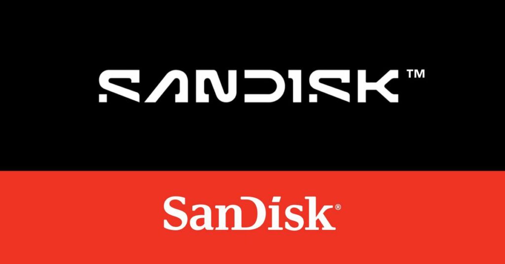
Here comes Sandisk with a rebrand
SanDisk, the popular flash memory company, is making some significant changes to its brand identity. As of recent announcements, SanDisk has dropped its classic inter-capped serif logo style in favor of a new and futuristic all-caps design.
According to reports, this bold rebranding effort is inspired by the concept of “a single point of data” or a “pixel.” The company claims that the letters now symbolize the collaboration and partnership required to achieve their purpose and tap into new possibilities.
Source: www.theverge.com


